Transform Your Brand With an AI Logo (No Designer)
Make an AI logo that doesn’t scream “AI.” 10-min brand setup + best AI logo makers + a checklist to avoid generic, ugly results.

Why I’m Recommending AI Logo Makers (Even If You’ve Never Designed Anything)
Getting a good logo is usually one of three things.
Slow. Expensive. Or you DIY it and it comes out looking like a generic placeholder you grabbed from a template site at 2am.
And the annoying part is, a logo is not optional. Even if you’re “not ready” for branding. The moment you make an Instagram page, a landing page, a Shopify store, an invoice. You’re branding yourself whether you want to or not.
What changed recently is that AI logo makers stopped being just random clipart generators. The decent ones now mix:
- templates that already follow basic design rules
- brand inputs that steer the style
- quick editing so you can actually fix the parts that feel wrong
So if you’re a beginner, you can get something usable fast. Like, today. Not in three weeks.
That’s what this post is about. How to create a brand ready AI logo without hiring a designer, and how to avoid the obvious “AI look” that makes a logo feel disposable.
One expectation though. AI is amazing for speed and iterations. You still need taste and a simple process. You need to check legibility, spacing, colors, and make a couple smart decisions. Not a design degree. Just a bit of care.
What Makes a Logo “Brand-Ready” (So You Don’t Waste Time)
Brand ready sounds fancy, but it’s pretty plain.
A brand ready logo is:
- recognizable: you can pick it out quickly
- scalable: looks good small and big
- consistent: works across places without breaking
- appropriate: fits the audience and category
If it only looks good on the generator preview, it’s not brand ready. It’s just a nice picture.
A logo has three jobs:
- Identification: people can recognize you
- Differentiation: you’re not confusing or easily mistaken
- Consistency: it holds up everywhere, not just on a website hero section
Before you generate anything, do this quick checklist. Seriously, it saves time.
- Brand name spelling, exact capitalization too
- Niche or industry
- Personality: modern vs playful, premium vs friendly, minimal vs bold
- Primary use: website header, app icon, packaging, storefront signage
Common mistake: chasing trends instead of clarity.
Overly detailed icons. Thin lines. Too many colors. Stuff that looks “cool” for five seconds and then becomes unreadable in a favicon or prints terribly on a label.
However, it's important to note that while having an effective logo is crucial for branding, it's not the only aspect to consider in your overall marketing strategy. For instance, incorporating interactive video content into your strategy can significantly enhance brand awareness and engagement with your audience.
Additionally, as we move further into 2025 and beyond, AI video content creation will become increasingly vital in producing standout videos
How AI Logo Makers Actually Work (And Why Some Results Look “Off”)
Most AI logo makers follow the same basic flow:
- You input brand name, industry, maybe a tagline
- You choose a style direction (fonts, symbols, vibe words)
- The tool generates a bunch of concepts
- You refine fonts, colors, icon, spacing
- You export files
There are two main approaches underneath:
- Template based generators: fast, lots of decent looking options, but can feel similar across brands
- AI assisted concept generation plus editor: more variety, sometimes more weirdness too, but better potential if you’re willing to tweak
Why do some results look off?
- your inputs are vague, so the tool guesses
- typography is inconsistent, especially spacing between letters
- the icon is overused in that niche
- spacing and alignment feel random
- colors are low contrast or too “stock brand kit”
What to look for when you’re scanning concepts:
- strong typography that holds up on its own
- simple shapes that don’t fall apart at small sizes
- clean spacing, nothing cramped
- easy to edit layers, at least in the tool, ideally exportable as SVG
If you learn to spot those, you can pick a good base fast. That’s the real trick. Picking a good starting point beats trying to rescue a bad concept.
Before You Generate: A 10-Minute Brand Setup That Improves Every AI Logo
This is the part people skip. Then they wonder why everything looks generic.
Pick 3 brand adjectives
Pick three words that describe how you want to feel.
Examples:
- premium, calm, modern
- bold, playful, youthful
- minimal, technical, trustworthy
Write them down. Keep them visible while you generate.
Choose your logo type
You’ll usually pick one of these:
- Wordmark: just the name, typography focused. Great for versatility.
- Lettermark: initials. Good when the brand name is long.
- Icon + wordmark: common for most businesses, but easiest to overcomplicate.
- Emblem: badge style. Works for clubs, coffee shops, heritage vibes, not always great for apps.
If you’re unsure, start with a wordmark or lettermark. Most “professional looking” brands can survive on type alone.
Decide on a color direction
Start simple:
- 1 primary color
- 1 accent color
- plus black and white versions
Avoid rainbow palettes early. You can always add color later. You can’t easily fix a logo that relies on six colors to look interesting.
Collect 2 to 3 competitor logos
Not to copy. To avoid accidental similarity.
Note what you do not want to repeat:
- the same obvious icon (mountain, leaf, lightning bolt, globe)
- the same shade of blue everyone uses
- the same generic sans font everyone picks
Bonus Tip: Transform Your Brand's Video Content
In addition to setting up your brand for a successful logo generation, consider leveraging video content as part of your branding strategy. With tools like Clixie, you can easily transform long videos into chapters. This can help in creating more engaging and digestible content for your audience.
Write one reusable style line
You’ll reuse this in tools as your “direction”.
Example: “minimal, geometric, modern sans serif, high contrast, tech friendly”
If you do nothing else, do this. It keeps you consistent while you explore.
Best AI Logo Makers to Transform Your Brand (What Each Is Best For)
I’m picking these based on a few things that actually matter:
- editing control, not just generation
- export formats like PNG and SVG
- how unique the results can get
- ease of use for beginners
- licensing clarity, or at least the ability to confirm it
Also, you don’t have to marry one tool. You can test multiple in one sitting, screenshot your top concepts, compare side by side, then only pay when you’re sure.
1) Looka. Best for fast, polished concepts and brand kits
.png)
Looka is one of the quickest ways to go from nothing to “okay, that looks like a real business.”
Strength: it generates polished concepts fast, and it nudges you into a cohesive brand kit. Colors, fonts, and matching social assets.
Best for: small businesses that want a clean logo plus matching assets without thinking too hard.
What to watch: concepts can feel templatey. Not always, but often enough. You’ll want to refine typography and spacing before exporting.
Tip: generate multiple variants, especially icon heavy vs type first. Then pick the simplest winner. The simplest one almost always scales better.
In addition to logo design, AI tools are revolutionizing various sectors including education with 10 best AI in education tools that assist teachers and students alike. Moreover, for small and medium businesses looking to supercharge growth in 2025, AI productivity tools present top solutions worth exploring.
While you're refining your logo design or branding strategy with Looka or other AI logo makers, consider leveraging AI video editing apps for creating promotional content or utilizing Learning Management Software (LMS) for training purposes.
2) Wix Logo Maker. Best if you’re building a Wix site and want everything connected
.png)
If your site is already on Wix, this is a smooth workflow. You can keep everything connected and deploy branding quickly.
Strength: the integration. What you choose in the logo tool can flow into site visuals.
Best for: creators and local businesses who want a logo plus website visuals aligned fast.
What to watch: don’t over design. Keep it readable as a favicon and as a social avatar.
Tip: export and test it in your site header and mobile view before finalizing. Some logos look fine big and instantly fall apart on mobile.
3) Tailor Brands. Best for done for you branding guidance
Tailor Brands is more guided. Less “here are 200 options” and more “let’s pick a direction and stick to it.”
Strength: it nudges you toward consistency. Fonts, colors, usage.
Best for: first time founders who need direction more than endless options.
What to watch: subscription and upsells. Confirm what files you get and what rights come with them.
Tip: prioritize a strong wordmark first. Add an icon only if it actually helps recognition, not because it looks fun.
4) Canva. Best for hands on editing and quick variations
Canva is not only a logo generator, it’s a fast editing environment. And that’s why it’s here. The ability to tweak layouts and produce variations quickly is the whole game.
Strength: powerful editor, easy spacing adjustments, easy to create social versions.
Best for: marketers and creators who need lots of branded assets quickly.
What to watch: icons can be overused. Your logo can end up feeling like a Canva template if you don’t customize the layout and type.
Tip: build a mini system inside Canva:
- primary horizontal logo
- stacked version
- icon only mark
- social avatar version
That alone makes you look more legit everywhere.
Video Content Creation Tools
While creating visual assets like logos is important, incorporating video content into your branding strategy can significantly enhance engagement. Consider exploring some of the best AI video generators for education which can provide unique ways to present information or services.
If you're looking for robust tools that allow for seamless video editing, check out these best video editing apps of 2025. These applications are user-friendly and perfect for marketers needing quick turnaround times on video content.
For those interested in comprehensive solutions that cater to various skill levels, here are some suggestions for the best video recording and editing software in 2025.
Lastly, if you're seeking budget-friendly options, consider these recommendations for the best free video editing software in 2024. These tools offer great value without compromising on quality.
5) Adobe Express and the Adobe ecosystem. Best if you already use Adobe tools
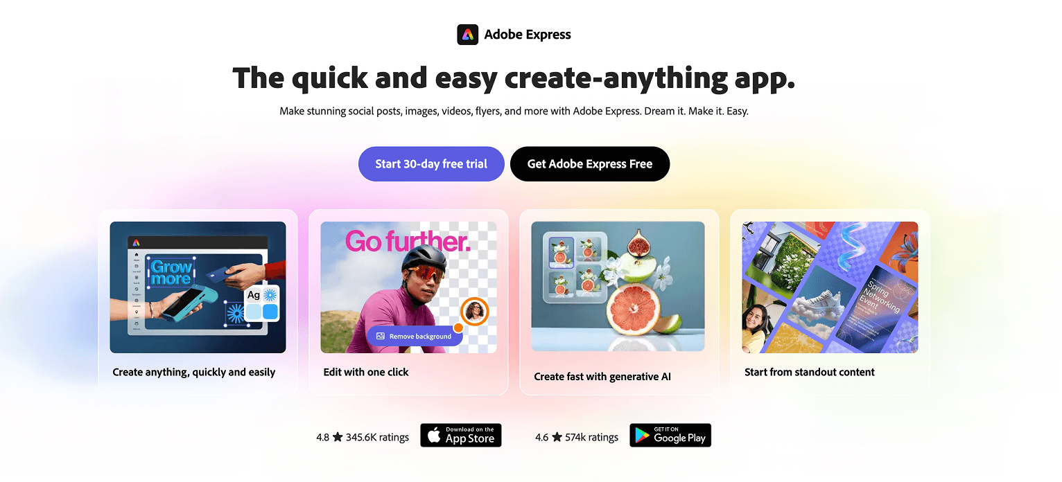
If you're already familiar with Adobe tools, using Express makes the most sense. It's also easier to hand off later if you hire a designer to refine the mark in Illustrator.
Strength: fits a more pro workflow and plays nicely with future refinement.
Best for: teams that may upgrade later to Illustrator level polish.
What to watch: keep shapes simple so they stay editable and scalable.
Tip: save versions with clear naming. v1, v2, final, final final. You’ll laugh but you’ll do it anyway.
Step-by-Step: Create Your AI Logo in 30 Minutes (My Simple Workflow)
This is the workflow I’d use if I had to create a logo today, for a new project, with zero help.
Step 1: Pick a logo type
Start with wordmark or lettermark for maximum versatility. If you’re tempted to start with an icon, pause. Icons are where generic happens. Type is where your brand can quietly feel expensive.
However, if you're considering incorporating visual elements into your logo, it might be worth exploring how to master AI tools for content creation or even using some AI image enhancement tools for better results.
Step 2: Enter the brand name carefully
Double check spelling. Decide on capitalization now. Add a tagline only if it’s truly necessary. Most of the time it hurts legibility, especially at small sizes. You can keep the tagline for your website header or hero section instead.
Step 3: Set your style direction
Use those 3 adjectives and your style line. If the tool asks for industry, pick the closest match. This can affect icon suggestions a lot, sometimes too much.
Step 4: Generate a lot, then shortlist fast
Generate 20 to 50 options. Screenshot anything that feels close.
Then shortlist 3. Only 3. If you keep 12 options, you’ll spin forever.
Step 5: Test legibility at small sizes
This is where most AI logos fail.
Test:
- 32px favicon size
- mobile site header size
- Instagram circle crop
If it’s unreadable small, it’s not a logo. It’s an illustration.
Step 6: Lock colors
Pick a primary color. Then create a monochrome version.
Your logo should look good in:
- black on white
- white on black
If it only works in color, it’s fragile.
Step 7: Export the right files
At minimum:
- PNG for web, with transparent background
- SVG for scaling and crispness
- ideally a version for dark background and light background
Name your files clearly. brand-logo-primary.svg, brand-icon.png, stuff like that.
How to Make an AI Logo Look Custom (Not Like a Template Everyone Has)
This is the difference between “AI logo” and “logo made with AI.”
Typography first
Adjust:
- letter spacing, especially in all caps
- weight, so it doesn’t look too thin
- capitalization consistency, so it feels intentional
Even tiny kerning tweaks can change the whole vibe.
Simplify the icon
If you use an icon, remove extra details. Aim for one strong shape.
If the icon has three elements inside it, it’s probably too much already.
Incorporating AI Animation into Your Logo Design
One way to make your logo stand out is by leveraging AI animation. This technique can add an engaging element to your brand identity, making it more memorable and unique.
Using AI Videos in Your Branding Strategy
In addition to static logos, you might also want to explore how AI videos can be integrated into your branding strategy. These videos can provide dynamic content that showcases your brand's personality and values effectively.
Use a distinctive color accent
Not five colors. One accent.
A small, consistent accent color can make a brand recognizable fast. But only if the monochrome version is still strong.
Avoid cliché icons in your niche
Some examples that get overused:
- lightbulbs for ideas
- globes for global
- generic swooshes for “movement”
- shield for “security”
- leaf for “eco”
You can use them only if you truly transform them. Different geometry, different negative space, different composition. Otherwise, you’ll look like everyone else.
Keep alignment and spacing consistent
This is the unsexy part that makes logos feel professional.
Use a grid feel, even if the tool doesn’t have a real grid. Match spacing. Center things properly. Don’t eyeball and move on. Eyeballing is how the AI look sneaks in.
Brand Consistency: Turn One AI Logo Into a Full Identity (Without Overthinking)
Once the logo is done, you can turn it into a simple identity in like an hour.
Define your mini brand kit:
- logo variants (horizontal, stacked, icon only)
- color codes (HEX values)
- 1 primary font and 1 secondary font, max
Create one usage rule:
- when to use full logo vs icon only
- minimum size for readability
- safe space around the logo
Then generate matching assets quickly:
- social banners
- profile icons
- email signature
- pitch deck cover slide
The goal is not to create a 40 page brand guideline. The goal is to look consistent everywhere people see you. That’s what builds trust.
Licensing, Originality, and Trademarks: What You Should Check Before You Commit
This part is boring, but it matters.
Licensing basics
Confirm:
- commercial usage rights
- what you get when you pay (PNG, SVG, vector files, brand kit assets)
- whether there’s any claim about exclusivity or uniqueness
Most AI logo makers do not give you true exclusivity. So read the terms.
Originality reality
AI plus templates can lead to similar looking marks. You need to assume someone else might have something close.
Do a practical clearance check:
- Google your logo concept and do a Google Images search
- search marketplaces in your niche
- check industry directories and competitor sites
If the logo matters long term, consider:
- a trademark search in your region
- and or a quick designer review before you file anything
Also keep documentation:
- receipt
- a screenshot of license terms at purchase time
- exported source files
Future you will thank you.
When You Should Still Hire a Designer (Even If You Start With AI)
AI is great. It’s not magic.
You should still hire a designer if:
- you’re in a regulated or high trust industry (finance, medical, legal)
- you’re spending serious money on ads and the brand needs to convert
- you’re packaging heavy (labels, boxes, retail shelves)
- you’re scaling into multiple locations or a franchise type situation
Also if you need a full visual system:
- brand guidelines
- custom icon set
- illustration style
- a distinctive, ownable wordmark
One smart approach is to use AI as the brief. For instance, Clixie AI offers valuable resources that can assist in generating ideas for logo design. Generate 3 concepts you like with their help. Bring them to a designer. Tell them what you like and what you hate. Now the designer is refining, not guessing. That saves money and time, and the result is usually much stronger.
Moreover, consider leveraging AI videos for your marketing efforts. They can significantly cut costs while driving results. This could be especially useful if you're packaging heavy or scaling into multiple locations.
In addition, using interactive videos as part of your eLearning strategy could also enhance your brand's visibility and engagement. If you're unsure about how to generate an AI video for free, this practical guide can provide valuable insights.
Wrap-Up: Your Fast Path to a Strong AI Logo (That Actually Fits Your Brand)
The simplest path looks like this:
Brand setup first. Then generate options. Refine typography. Test small sizes. Lock colors. Export the right files.
That’s it.
Pick one tool from the list, generate 30 options, shortlist 3, and finalize one today. Not next week.
You can absolutely transform your brand with an AI logo and still look professional. No designer required, at least to start. The key is you act like a curator, not a button clicker.
FAQ
Can I use an AI generated logo for commercial purposes?
Usually yes, but it depends on the tool’s license and the plan you purchase. Always check the licensing terms and confirm commercial use is included before you commit.
What file formats do I actually need?
At minimum, get a transparent PNG for web use and an SVG (or other vector format) for scaling. If you plan to print, vector matters a lot.
Why does my AI logo look blurry or cheap?
Most often it’s because you exported only a small raster file, used thin lines, or the design has too much detail. Export vector if possible, simplify the mark, and test at small sizes.
Should I choose an icon logo or a wordmark?
If you’re unsure, start with a wordmark or lettermark. It’s easier to keep unique and readable. Add an icon later only if it truly helps recognition.
Also, consider leveraging AI tools beyond just logo creation. For instance, Clixie AI can supercharge your video engagement which is beneficial for brand promotion. Furthermore, if you're in the education sector and looking to create effective teaching plans using AI, check out this ultimate guide.
How do I make sure my logo isn’t too similar to someone else’s?
Do quick checks: Google Images, search competitors, and scan your niche on marketplaces and directories. For higher stakes brands, do a trademark search before investing heavily in the mark.
Can I trademark an AI made logo?
Sometimes, but it depends on your jurisdiction and whether the mark is distinctive and properly cleared. If trademarking is important to you, talk to a trademark professional and verify the tool’s licensing terms first.
What’s the biggest mistake beginners make with AI logo makers?
They pick the most complex option. Too many colors, too many details, trendy effects, unreadable type. The simplest clean option usually wins in real life.
FAQs (Frequently Asked Questions)
Why should I consider using AI logo makers even if I've never designed anything before?
AI logo makers revolutionize logo creation by combining templates, brand rules, and quick editing tools, allowing beginners to create usable, brand-ready logos fast without hiring a designer. They solve the common problem of traditional logo design being slow, expensive, or resulting in generic DIY logos.
What makes a logo "brand-ready" and how can I ensure my AI-generated logo meets these criteria?
A brand-ready logo is recognizable, scalable, consistent, and appropriate for your audience. It fulfills three jobs: identification (being easily recognized), differentiation (not confused with others), and consistency (working well across all platforms). Before generating a logo, check your brand name spelling, niche/industry, personality (e.g., modern vs playful), and primary use to avoid wasting time.
How do AI logo makers work and why do some AI-generated logos look off or unprofessional?
AI logo makers typically work by taking inputs like brand name, industry, and style to suggest concepts which you then refine by adjusting fonts, colors, and icons before exporting. Some logos look off due to vague prompts, inconsistent typography, overused icons, poor spacing, or low-contrast colors. Look for strong typography, simple shapes, clean spacing, and editable layers for better results.
What should I do before generating an AI logo to improve the quality of the design?
Spend 10 minutes on brand setup by selecting 3 brand adjectives (e.g., premium, calm, modern) to guide style choices; choosing your logo type (wordmark, lettermark, icon + wordmark, emblem) based on usage; deciding on a color palette with one primary and one accent color; collecting competitor logos to avoid similarities; and writing a simple style line like 'minimal, geometric, modern sans-serif' to reuse in design tools.
Which AI logo maker is best for fast generation of polished concepts with cohesive brand kits?
Looka is best for fast generation of polished concepts along with cohesive brand kits including colors, fonts, and social assets. It's ideal for small businesses wanting clean logos and matching assets quickly. However, watch out for template-like concepts and refine typography and spacing before exporting.
What are some tips when using Wix Logo Maker for creating an AI-generated logo?
Wix Logo Maker offers smooth workflow especially if you're building a Wix website as it connects your branding easily across platforms. It's best for creators and local businesses wanting aligned site visuals. Avoid over-designing; keep your logo readable as favicon and social avatar. Export your logo and test it on site headers and mobile views before finalizing.
.png)
.png)